Kim C.
2015-02-11 08:02:22 UTC
Hi all,
In the attachment or this link (Loading Image... ) you'll find the decision tree I made. I used the Rpart package to make the tree and the rattle package using the fancyRpartPlot to plot it. The data in the tree looks different than about every example I have seen before. I don't understand how I should read it. I want to predict Product (which are productkeys). The variables to predict it contain age, incomegroup, gender, totalchildren, education, occupation, houseownerflag, numberCars.It looks like the upper number is a ProductKey. The "n" is number of observations? And the percentage of the yes/no question below.
This is the code I used.
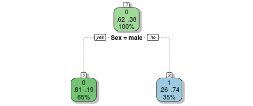
 ). This is from Trevor Stephen's TItanic tutorial. The first node show that 62% of 100% doesn't survive. If they were male, only 19% of them were survivors. I find that a lot examples look like that. Why does mine predict per ProductKey and every node it has something else. it doesn't make sense to me. And it doesn't have the two numbers like .62 and .38 but it has n=197e+3. So should I read the first node like "For 100% of the observations of ProductKey 1074, the incomegroup was moderate)"?
Thank you!
Kim
In the attachment or this link (Loading Image...
 ) you'll find the decision tree I made. I used the Rpart package to make the tree and the rattle package using the fancyRpartPlot to plot it. The data in the tree looks different than about every example I have seen before. I don't understand how I should read it. I want to predict Product (which are productkeys). The variables to predict it contain age, incomegroup, gender, totalchildren, education, occupation, houseownerflag, numberCars.It looks like the upper number is a ProductKey. The "n" is number of observations? And the percentage of the yes/no question below.
This is the code I used.
ss.rpart1 <- rpart(Product ~ ., data=sstrain, control=rpart.control(minbucket=2,minsplit=1, cp=-1))
spt <- which.min(ss.rpart1$cptable[, "xerror"])
scp <- ss.rpart1$cptable[opt, "CP"]
ss.rpart2 <- prune(ss.rpart1, cp=cp)
fancyRpartPlot(ss.rpart2)
So why does the tree looks so different from the most (for example: Loading Image...spt <- which.min(ss.rpart1$cptable[, "xerror"])
scp <- ss.rpart1$cptable[opt, "CP"]
ss.rpart2 <- prune(ss.rpart1, cp=cp)
fancyRpartPlot(ss.rpart2)
 ). This is from Trevor Stephen's TItanic tutorial. The first node show that 62% of 100% doesn't survive. If they were male, only 19% of them were survivors. I find that a lot examples look like that. Why does mine predict per ProductKey and every node it has something else. it doesn't make sense to me. And it doesn't have the two numbers like .62 and .38 but it has n=197e+3. So should I read the first node like "For 100% of the observations of ProductKey 1074, the incomegroup was moderate)"?
Thank you!
Kim